


How about dat? Just a short time after our Letter that touched upon the joys of typography and kerning, I was being driven around the inner recesses of Boston. And as we made our way past South Hall (on the Northeaster campus) I couldn’t help but notice this jaw-droppingly, attention-grabbingly building label:
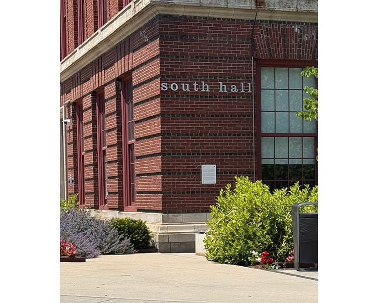
YUCH! First off, all lower case. What the what? That’s a proper name - so indicate it properly! South Hall: good. And decidedly not good: south hall.
But that’s not the first thing I noticed. The TERRIBLE spacing was what grabbed my gaze and held it tightly. I guess they’d already bought the letters and figured “Well, if we go all the right up to the edges I guess it’d fit …”
PUHLEEZ. Show some respect for the letters (and words). HERE is what it should have looked like (presuming they just HAD to use all lower case):
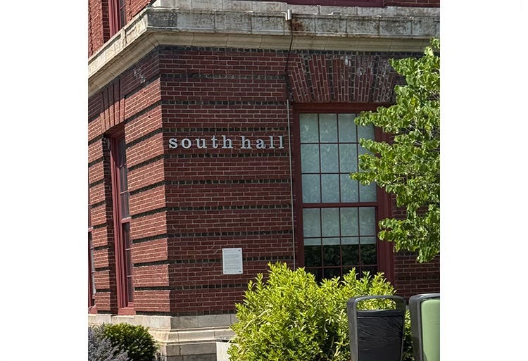
Space between the two words and space between the words and the building’s edges - that’s just common sense. I’m afraid if I was a professor there I’d have to give whoever put the sign up a C-. At best. Maybe their problem was just had a lack of sufficient manpower …
Yep, when a task seems too large, just get a lot of helpers and you’ll be done in a trice. Or, conversely, when the task seems TOO overwhelming … step back and take a nap.
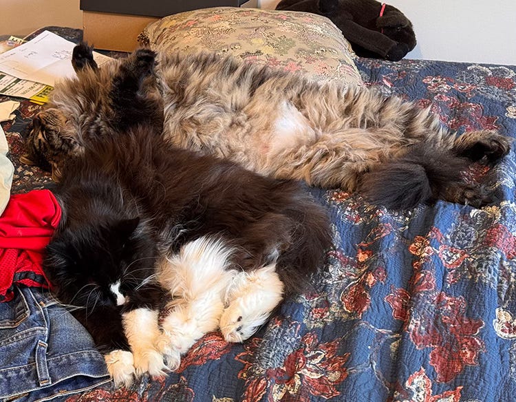
Yes, there’s no problem so large that it can’t be improved by a bit of shut eye. Certainly that’s Aubrey and Sophie’s philosophy!