


Letter 121 - Don't letter me down

I just finished watching Saving Mr. Banks, a fictionalized account of how P.L. Travers’ book Mary Poppins eventually became a Disney movie. After twenty years of trying! And one of the Travers’ many requirements was that there be no animation. No dancing penguins!
Well, I ask you. Where would the world be without dancing penguins? Or smart aleck rabbits or mice with black rubber hose arms? The answer: a poorer place. Especially for cartoonists because we make the big bigBIG bucks with talking animals. Humans (some at least) like to crow that they’re the height of evolution, the best of the best, but all you need to do is put one into the water to knock them down a peg.
And it may be true that through a quirk of evolutionarily determined social structure and some tens of thousands of selective breeding we managed to create a species that we think is “our best friend”, that bond only extends so far.
But to return to Mary Poppins. After watching the movie I decided to read the book, something I’d never done as a kid. And … wow. Very weird. However what I want to point out isn’t the philosophical and ontological content but something far more down to earth. The printing. Here are two lines from the same page, although not the same sentence:
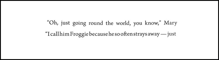
Anything stand out? That’s right! the spacing between the words! And here they are with yellow rectangles filling the white space to show it even more clearly.
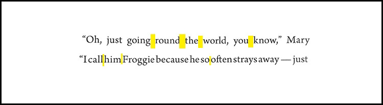
The space between words is known in typography as “word spacing”. (Wow - whoever coined that really phoned it in, didn’t they?) It’s pretty important because without any space between words it’saseasytoreadasthis. In other words, not very. And you can see that the last line of my examples approaches the no-spacing zone pretty closely. Very awkward looking. Yet the spacing of the first line is so wide that it looks just, well, wasteful.
Back in the old days, when books were hand set using little lead pieces, each with a single letter, the typesetter could easily choose his or her spacing to make it look juuuust right. But nowadays it’s done electronically and sometimes it falls far short of perfection. As we can see in my example. Humans for the win!
By the way, a fancier name is used for the space between the letters that make up a single word: kerning. And boy, can it be important. Consider:

See? The word “FLICK”.
Wait, that’s not what you saw? Maybe a bit more space between the L and I is called for …
I’ve seen this exact issue several times and it’s not the only problem arising with bad kerning. So if you want your message to come across clearly, be concise and pay attention to your typography!

Keep reading with a 7-day free trial
Subscribe to Letters from Satz to keep reading this post and get 7 days of free access to the full post archives.